Hello Aceinna Team,
@Li-YiFan @cek @Dong-xiaoguang
Above graphs have various spikes for eg. Altitude vs Time (s) have spikes everywhere. Can you please tell the reason for such behavior? Is it because of some fault in EKF algorithm because what I think is that outputs like Altitude and various other parameters from EKF must showcase smoother behavior. Upon zooming, I can also see sudden spikes in parameters like roll, pitch, latitude etc.
Posts made by Shivashish
I have connected a gps receiver with IMU300Zi ( vis UART) and output from gps is 1 Hz, Protocol-out is UBX and messages out is only NAV-PVT. I have flased INS app ( VS code) using st-link and have used same configuration for ublox receiver as mentioned at https://navview.blob.core.windows.net/web-resources/Instructions to run INS app on OpenIMU300ZI with GNSS.pdf?_t=1592504841811 .
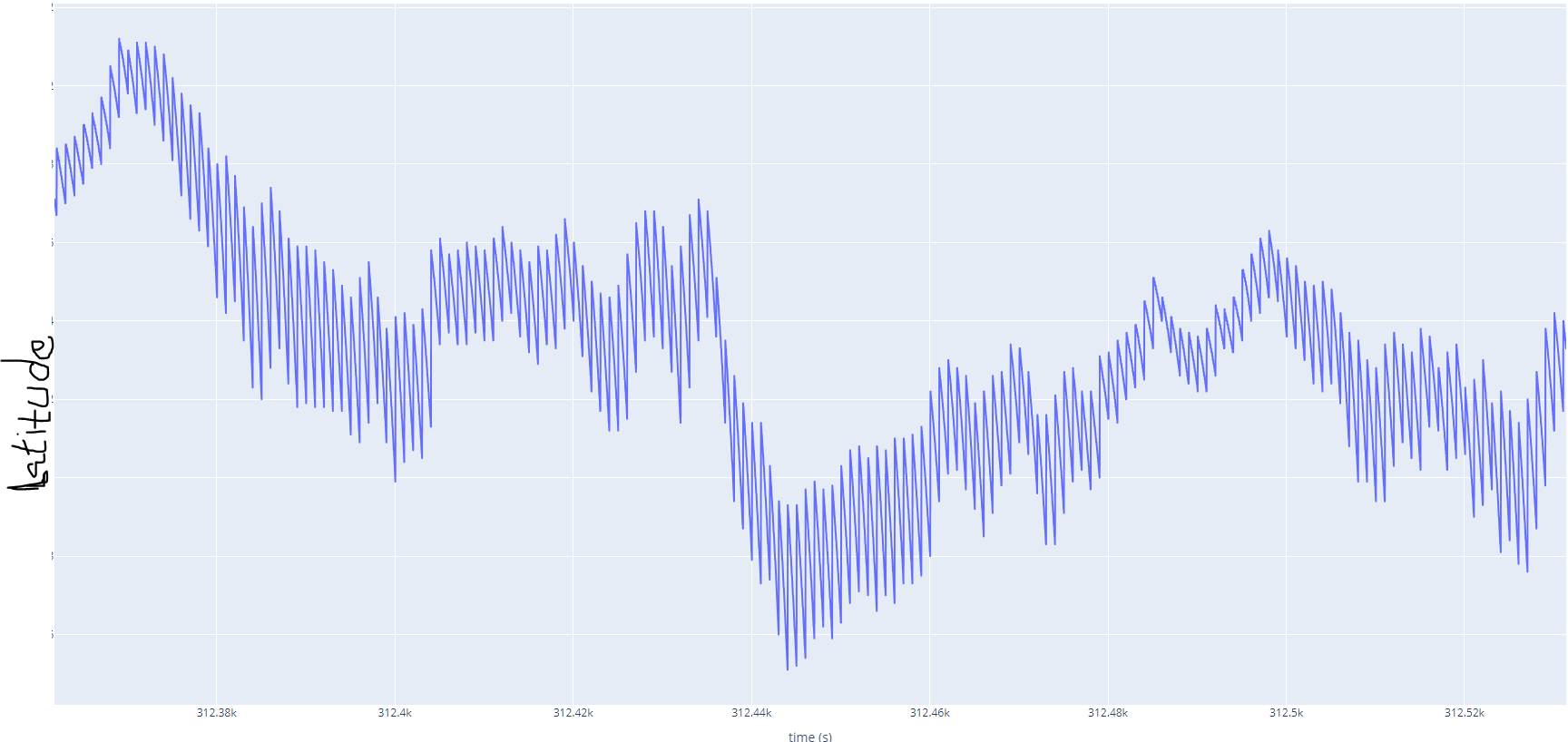
I get gps data and I can see it on Acienna navigation studio but because INS app's default rate is 50 hz and GPS rate is 1 Hz, I can see a lots of spikes because of this issue ( you can see in the below photo)
Can someone help me how can I get smoother/filtered data ?
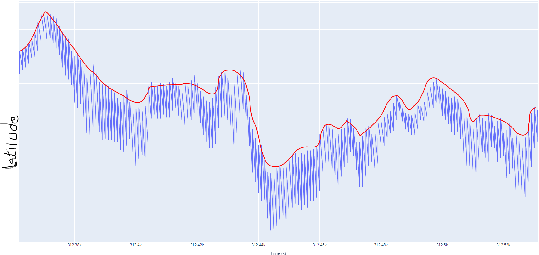
What I want to achieve is a smother curve something similar to marked in red colour below( or filtered values for Latitude, lon and other parameters) 
What can it be:
Is it a timing issue between IMU and GPS module ? (I have already connected IMU and GPS by 1PPS pin and I receive a pulse every second on IMU. )